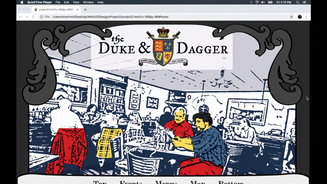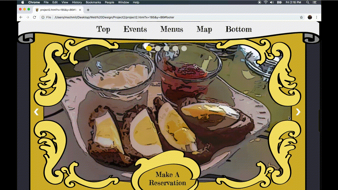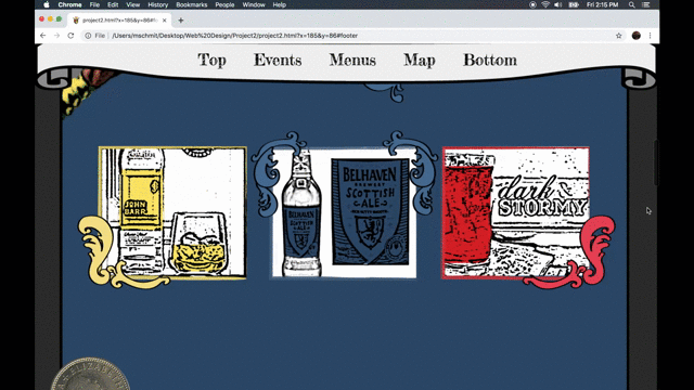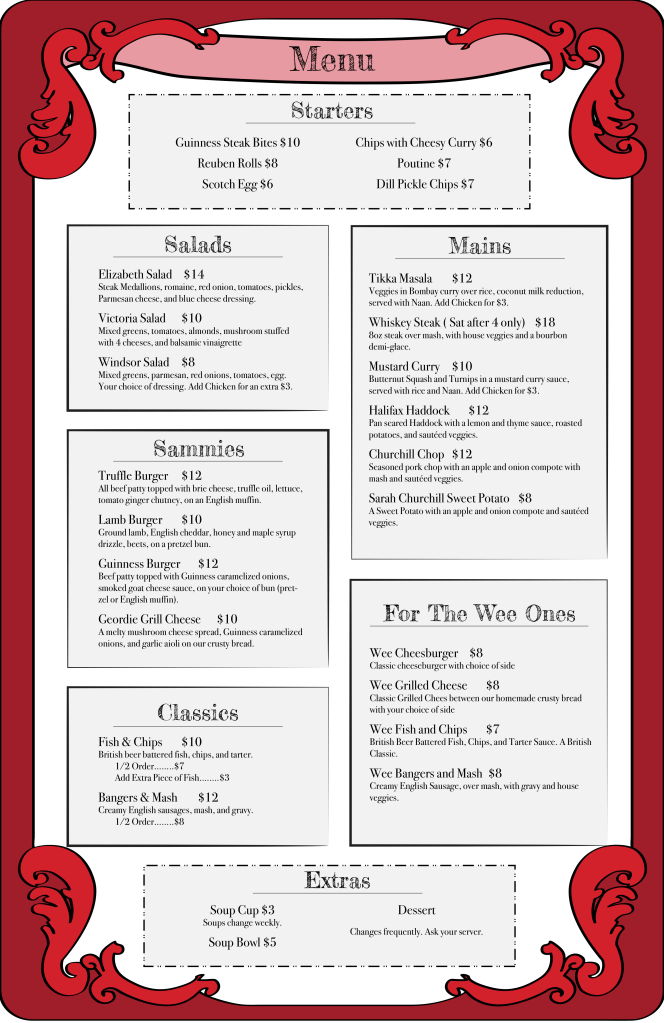
On of my assignments for a web design course was to redo the website of a local restaurant of our choice and to make the websites branding match the kind of restaurant that the place was. So I decided to redo the website for a place called the Duke and Dagger, which is a British pub in Menomonie, WI. The restaurant itself already had this logo that was reminiscent of the woodcut printing style that was popular in Europe during the 15th century. So going off of that I tried to design the rest of the website to have a similar look to it, using thicker strokes to invoke that style. I also carried over the colors from the logo into my design for the rest of the website so that it would feel cohesive with the restaurants brand.